Resources for E-Commerce Business Success
Nabamita Sinha, 4 days ago

Much like in real life, anything on the web needs to be unique and distinct to be remembered.
Your website or product needs to battle out the routine of the internet and come out on top so people are aware of your business and your offering.
Attention can be had by a lot of means. The visual medium takes the cake though.
That’s because we process visual information 60000 times faster than text. With 90% of the data transmitted to the brain being visual, visual content is the best possible medium to convey information.
Your landing page or product page needs to grab the visitor’s attention instantly. This is where you exhibit your most valuable asset – a video.
If a picture is worth a thousand words, a video equals thousands of such pictures. The video combines image, text, and audio to tell an engaging story.
No reason to not have it.
In fact, 73% of consumers are more likely to purchase your product after watching explainer videos. So having a video on your landing page can improve your conversion chances by up to 86%.
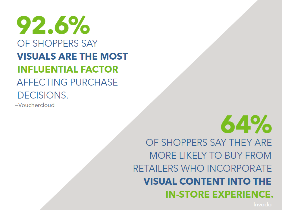
And that’s only a handful of statistics in a pool of innumerable successes of videos on landing pages or product pages.
Crazy Egg raked in 64% more conversion with $21,000 additional monthly revenue by adding a high-quality explainer video to their landing page. Dropbox got $48,000,000 extra revenues by using a video on their landing page. NotifyFox saw an 18% boost in account signups, bringing onboard 100+ new customers.

And, by the way, things are getting more interesting. You can even include 360° videos or images on your sites to immerse your audience.
Apple does it phenomenally with its Mac Pro. The website showcases their product inside out, in a tutorial like fashion while being interactive. The webpage responds to your scrolling.
Same as you, your visitors would rather have a hands-on experience of your product.
Videos tutorials, 360 demos, and detailed, engaging webpage walkthroughs – like that of Visme – deliver a value proposition to the customer and leave little to no doubt about what they are paying for.
All of which nets you more customers; satisfied, more customers.
Read also: 10 Benefits of Video Marketing for Small Businesses
An exit pop-up is a last-ditch effort in trying to get a conversion.

Popups are generally considered to be an annoyance.
It’s appalling to be reading an article and suddenly having your whole screen covered with some damn accomplishments of the website or their product.
No matter how valid, they interrupt your focus, which is hard to acquire in the first place with distractions abound.
Why exit popups are not bad is because you’re trying to catch a lead when it’s already disinterested in your product or website. Exit popups can help you net up to 15% of your outgoing visitors.
They are already leaving, so might as well try and see if you can convince them one last time. A minor annoyance would hardly change it.
Your page exit popups need to make the cut in catching attention first.
Utilise snazzy pictures. If you have a product, use some suave images of it.
Make sure to deliver some value proposition in addition to what the visitor was getting on the web page already.
Your exit popup should provide in-depth, free content, address pain points, or even ask them what they need help with.
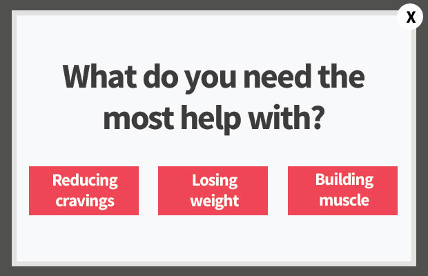
You can offer discounts in a big bold text or other monetary benefits like the immensely successful free trial month of Netflix.
You can offer the visitor to chat with some personnel to better address their problem.
Or your popup can have comic relief.

Make your last-ditch effort as good as your first impression. It might just give you that extra conversion number crunching to be happy with over the weekend.
Blank tests.
It’s like a/b testing but not with analytics but your guts.
A blank test enables you to step into your customer’s shoes while having the creator’s eye.
Just open your product/landing webpage, and cover the images on it with your hand.
How much difference does make to your webpage?
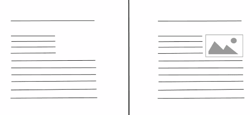
Does it read better?
Do your CTAs stand out more?
Or does your webpage look bland without images? Unsavoury even?
This small test should give you a fair idea of what images do to your webpage; if the image/video should have greater prominence, or if you need less text with more white-space or less.

You can shuffle up designs and typefaces to see what fits better with what kind of images.
As a general rule of thumb, you need your visual content to assist in drawing the viewer’s attention to CTAs, pain/selling points.
Granted, your webpage Call To Action copy needs to be crisp. But that won’t ensure that it gets clicked on.
You need to set up the stage for conversion. One of the most important aspects of an effective CTA is you direct the visitor’s attention to it.

You can use white space, arrows, or colour contrast to direct the visitor’s attention to where you want it to go. There are a variety of psychological responses that you can use to direct your visitors’ attention and get them to click on it.
You can use a combination of them as well. Colour contrast with arrows. White space with colour contrast. The list grows.
You can make them subtle –

Or obvious –
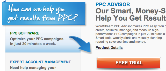
Arrows are good, but it’s better to use human images and faces – as few of them as you can manage, preferably 1 – looking in the direction of your CTA.

You can even employ design elements that subtly make the page ‘flow’ towards your CTA with colours, or design, or patterns or a combination thereof.
One caveat to using images:
It’s a great idea to use human, non-stock images, but ensure good quality. Blurry, low-res images turn people away from your website.
You need to showcase that you deliver the best in the smallest of things. Use good quality images.
Don’t overdo the human factor in your webpage images. Your images shouldn’t be crowded with people and faces. It creates chaos and confusion in the mind of the visitor without inducing any positive and discernible emotion in them regarding your product.
Directional CTAs, design changes, and the use of good quality images are very small UI/UX changes with a basis in human psychology that can bump your conversions significantly.
Emotions are the guide pole for every buyer.
If a buyer feels they are happy, comfortable, or even ok, with a purchase they are about to make, they most likely will.
Think of your trip to a grocery store where you encounter a new fruit or a company of food.
When or why will you give them a shot?
Does their brand have trusted affiliations? Are they known? Do other people know about it? Has anyone suggested that brand to you? How good is their marketing?
You need that positivity associated with your brand so people can build a trust factor which can lead to easier conversion and even organic popularity.
Airbnb’s Instagram is a hallmark of this.

It induces a sense of comfort, relaxation, and contentment through the use of Airbnb’s services.
You can include photos of happy or content people using your product on your webpage as an assurance to potential buyers.
Massage chair companies do that a lot.
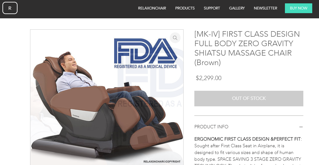
Again, use human faces that are expressive of positive emotions.
Some brands can work off different emotions. For instance, sports brands like Nike, Adidas, Gatorade work off a more aggressive, ‘sporty’ emotional stance. Their ads induce determination, goal orientation, achievement, etc.
Humans are social creatures, so any form of social approval goes a long way in establishing your product’s validity.
Squatty Potty not only has the most bizzare and attention-catching video, but they also have their testimonials game up in the clouds.
Their web pages have Instagram pictures and videos covering pretty much every emotion and situation. You can find yourself adoring, speculating, laughing, or simply being satisfied with the product while looking through the testimonials.
It’s great.
Use social proof. The more visual, the better.
Datorama does it more subtly given its differing nature of business with big names on a neat page.
Either way, integrate videos or images from visual social media platforms like Instagram or Facebook.
Make sure to identify and rope in influencers or professionals from your industry to try your product and talk about it on social media, or at the very least on your webpage.
Read also: Top Tips for Becoming a Social Media Influencer
Influencers are the single best way to an immense and dedicated niche audience. Fish them out.
Your goal is to convert more, but you need to focus on the journey to that goal more than the goal itself.
Establish good relations with your visitors, give them knowledge, give them resources, be transparent, be comical, ease your visitors, establish a comfortable space, and build a relationship that offers value.
Experiment with different forms of visual media- good videos, images, memes, infographics, or simply great design.
Have you tried out any of these visual content strategies? Or do you know of a better conversion hack? Let us know in the comments below.
Mashum Mollah is an entrepreneur, founder and CEO at Viacon, a digital marketing agency that drive visibility, engagement, and proven results. He blogs at BloggerOutreach.io.