Why Companies Are Relying on HR Agencies for Executive Search
Barsha Bhattacharya, 6 hours ago

Barsha Bhattacharya, 2 days ago

Barsha Bhattacharya, 1 week ago


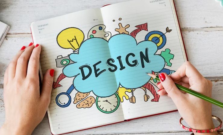
At the heart of any good design are stunning visuals consisting of images, pictures, and other design elements. They are the first thing we notice when we look at a product package, book cover, or website. Design elements are crucial parts of a design project. They determine the first impression, convey the message, and distinguish ordinary designs from exceptional ones.
In this guide, we explore the art of using visual elements in design. Whether you are making print designs on a box mockup, or a simple flyer, these tips will change your design game!
If design is a language, then visual elements are the vocabulary. This means that to communicate the true message of your creative work, you have to skillfully use visual or design elements.
There are tons of elements that come into play during a design process, but we’ll look at some of the most important ones.
They are:
Now that we know the six essential design elements, let’s see how to use them effectively to create breathtaking designs.

The first step to choosing the right image is understanding the purpose, audience, and message of your design. For example, a travel website targeting adventurers and explorers may feature vibrant, high-resolution photos.
On the other hand, a corporate annual report may require more restrained visuals. Whether you’re designing a website, a poster, or a social media graphic, ensure that your images align with your goals.
Composition is the arrangement of different elements within your design. It can alter the course of your creative work depending on how you use it. So, for the best results, it’s important you apply the principles of composition. They are:
The best designs out there are the ones that can evoke a certain emotion within their audience— this is where colors come in. It is important that you choose color schemes that not only reflect the content but also convey a distinctive feeling.
For example, when designing a package for a sustainable, eco-friendly product you may want to lean towards earthy colors that convey this mood.
This is not to say that you cannot get creative and break stereotypical designs but ensure that the colors align with the overall message. Additionally, pay attention to contrast between elements, such as text and background to ensure readability and better visual interest.
Fonts and text placement are crucial for a successful design. They represent the tone of your entire work and also serve aesthetic purposes. To elevate your design, you’d want to select fonts that align with your target tone and message. Pay attention to brand identity, strive for uniqueness but also prioritize clarity.
Achieving visual harmony is about ensuring that all design elements work together seamlessly. Consider how each element from images to lines, and colors contributes to the overall design. At the end of the day, you should aim for two results— an aesthetically pleasing work, and compelling narrative.
To bring your design ideas to life, you’ll need the right tools and resources. Photoshop is the go-to tool for making high-quality PSD designs. Nevertheless, you can explore other tools including the giant library of creative resources on Yellowimages. You’d find this platform if you are looking to access high-quality images, fonts, 3D mock-ups, icons, and many more.
Whether you are designing your next flyer or product package, mastering the art of using design elements will undoubtedly impact your work. Remember, every image, line, or color, carries the potential to speak volumes. However, it all depends on how you weave them to convey your true message. You’d speak more clearly with your designs with mockups from Yellowimages.com. You can buy 3D mockups or take advantage of their free offerings. They’ve got you covered.
Read Also:
Ankita Tripathy loves to write about food and the Hallyu Wave in particular. During her free time, she enjoys looking at the sky or reading books while sipping a cup of hot coffee. Her favourite niches are food, music, lifestyle, travel, and Korean Pop music and drama.